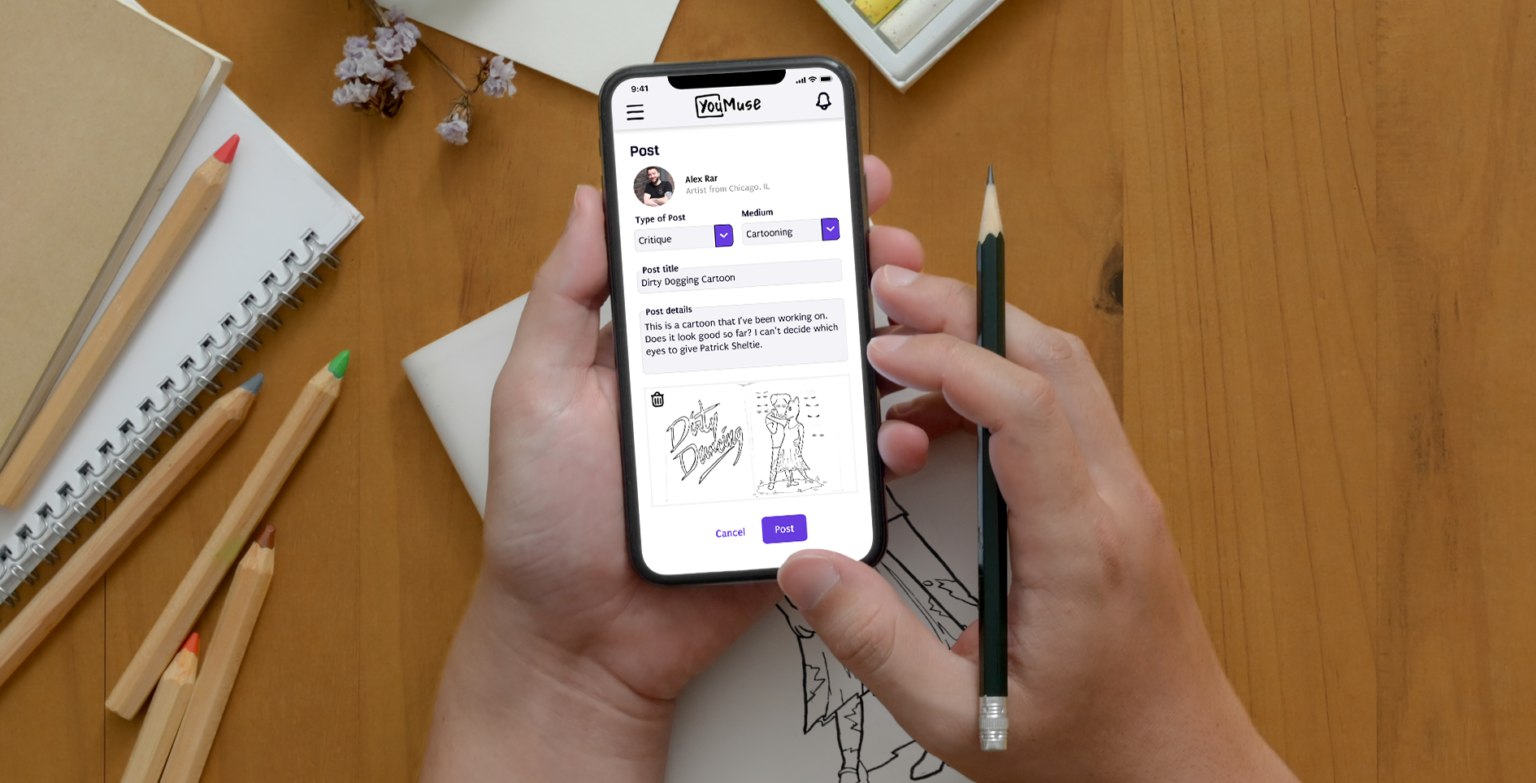
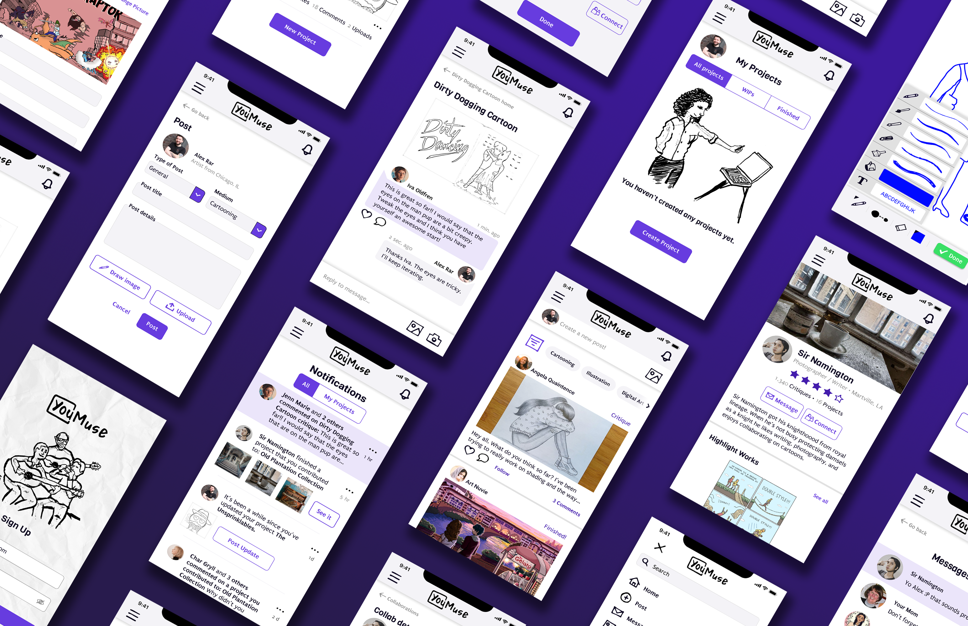
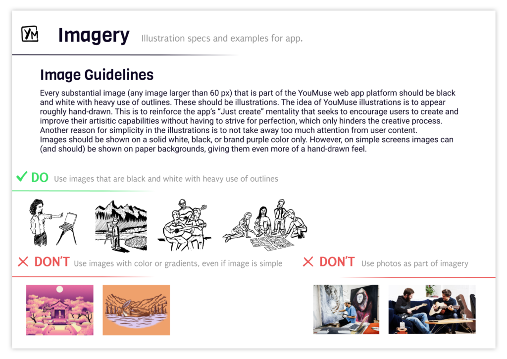
YouMuse is a social community web app that gives creative artists a space to develop, learn, grow, and collaborate. The interface elements are simple and organic. You will notice many elements, including the illustrations and icons, are sketchy and imperfect. This is intentional in order to encourage users to create freely without obsessing over perfection. The color scheme is minimalistic so the interface does not distract from user content.
Role: UI Designer, UX Designer, Illustrator
Timeframe: August – October 2021
Deliverables include: Wireframes • user flows • mood boards • style guide • user tests • high fidelity mockups • clickable prototype
Project: A UI focused student design project as part of CareerFoundry’s curriculum. The goal was to better understand visual design principles and how it relates to an intuitive, accessible, and delightful experience for users.

Many artists, professional or hobbyists, are passionate about what they do and desire to hone their craft, but do not have trusted friends or colleagues who can give them regular advice or critiques in order to take their skills to the next level.


Create a safe social app that allows artists to share their work-in-progress creations and get feedback, advice, and critiques from trusted friends and connections.

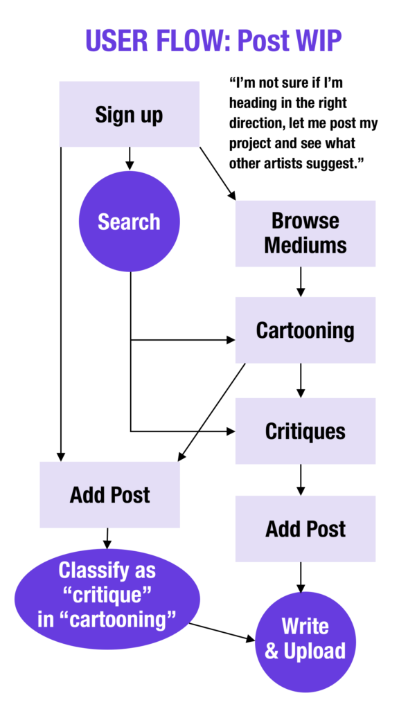
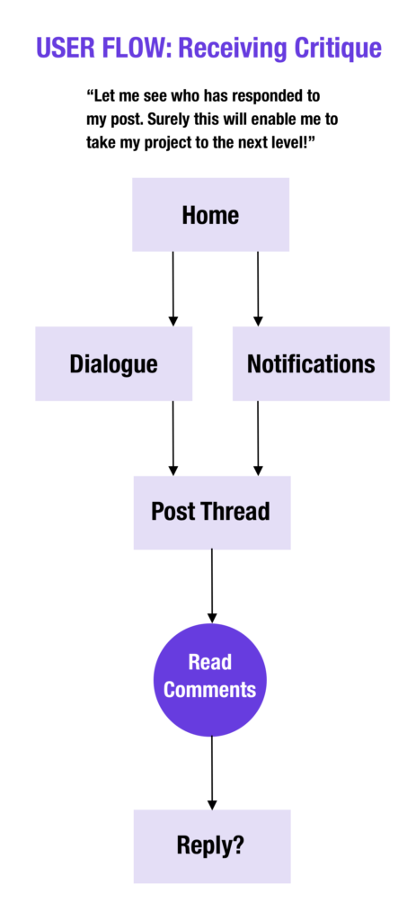
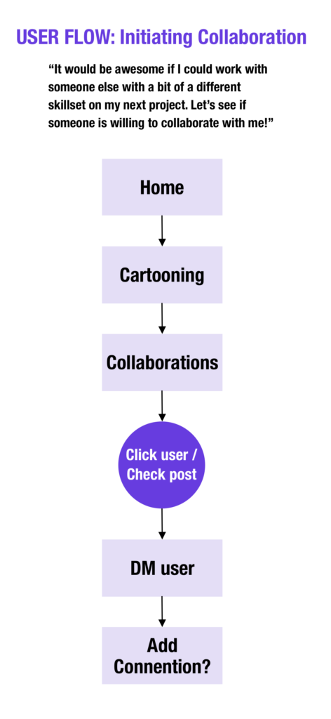
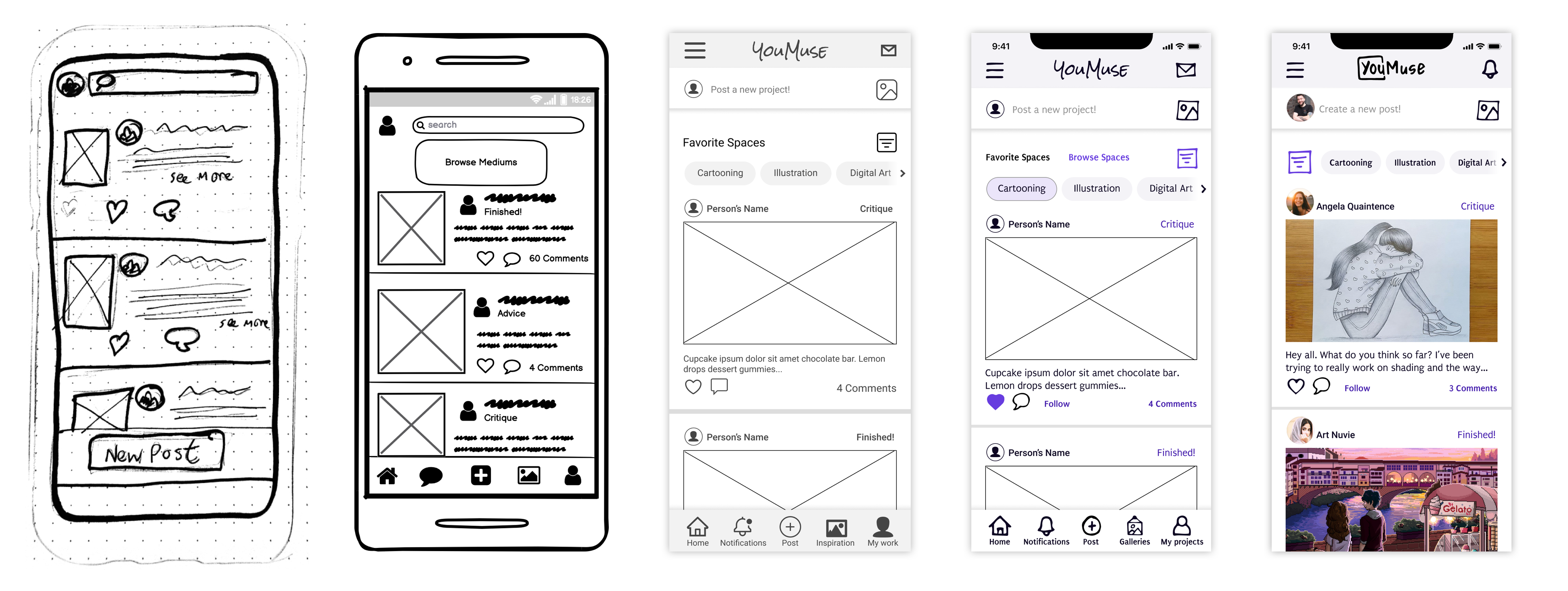
The sketching and wire framing process started with the most important flows for the app’s success:
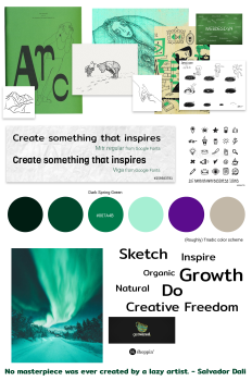
Mood Board
I used a “Sketchy” Mood Board would be the best choice for my objective as it definitely fit the bill for my “practice over perfection” mantra. I determined that if the app featured imperfect hand-drawn elements in it then it would constantly remind users to simply create without overthinking.
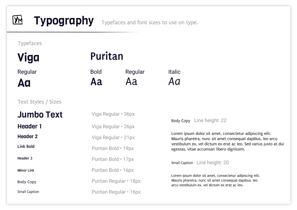
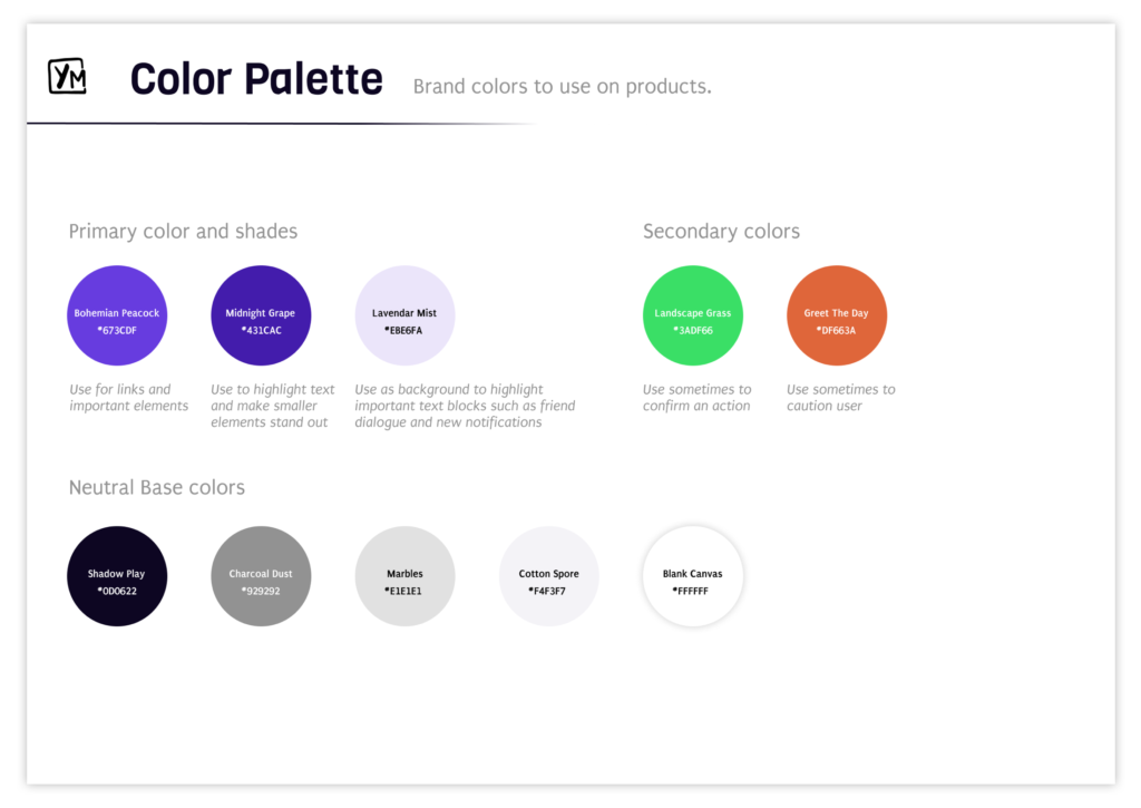
The app would use straightforward and readable typefaces with a slightly organic feel. The typefaces would be a complimentary yet distinctive pairing. The app would use a minimalistic color scheme in order to avoid distracting users from content. Receiving feedback can lead to certain anxiety so I thought it important to stick to mostly cool colors to help users relax when using the app.



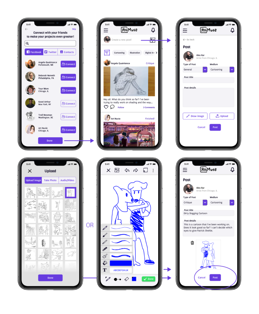
Feature 1: Fast Posting
The idea is to get your ideas down quickly or out to your connections whether it be a concept or final version. YouMuse gives you the option of uploading art or digitally sketching an idea or concept in order to get feedback.
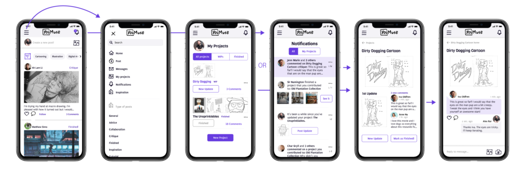
Feature 2: Check Critiques
Since feedback from trusted connections is so important there are many ways of getting there and communicating with critique givers.
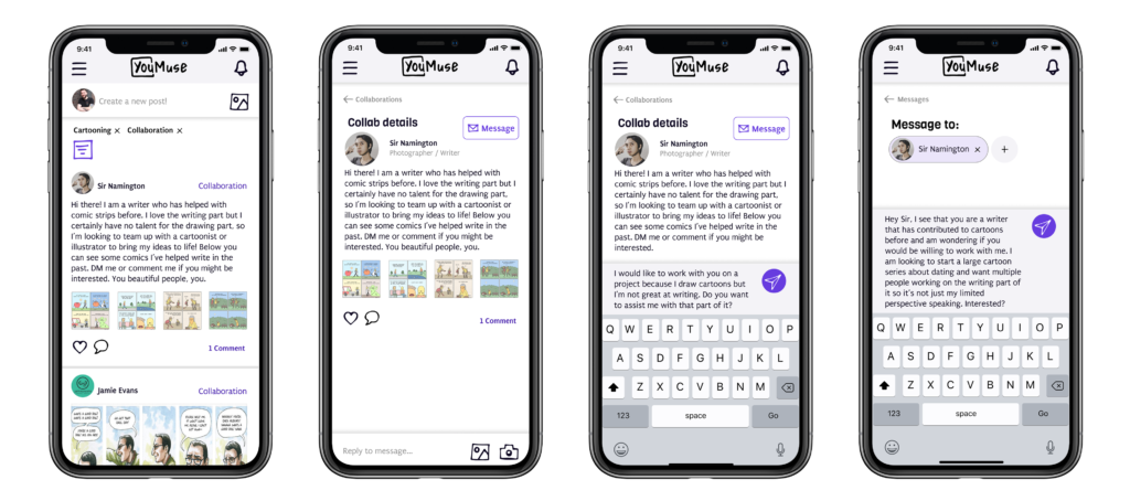
Feature 3: Collaboration
Something magical happens when artists combine their unique talents to create something unique. YouMuse makes it easy to collaborate with other individuals.