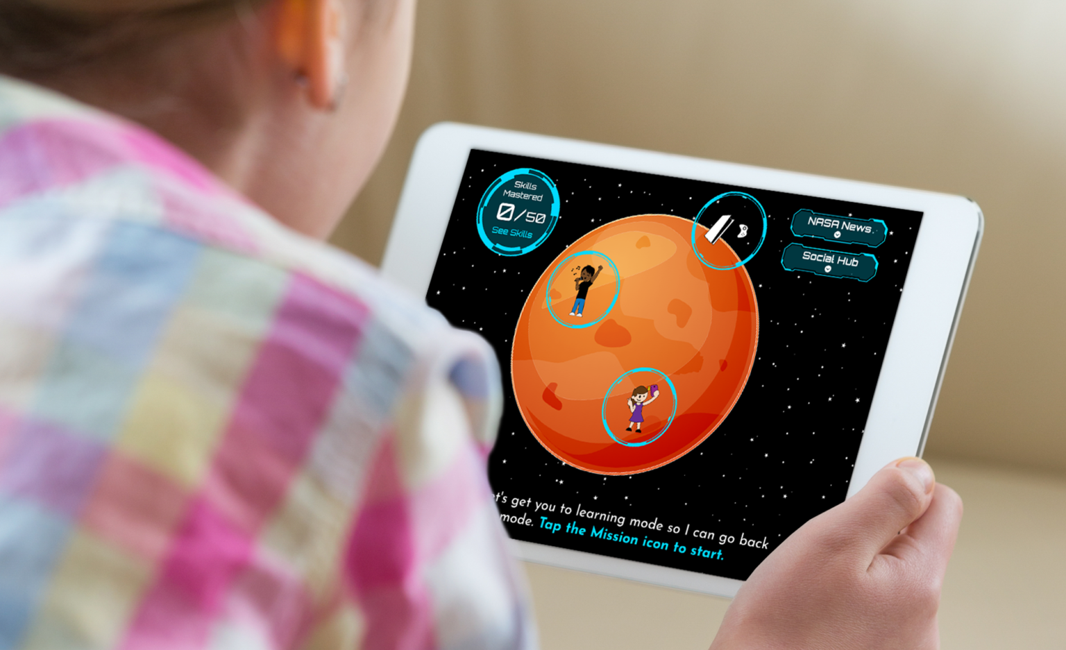
“The Teenager’s Handbook” is an iPad app that seeks to engage and entertain tweens while teaching them about NASA JPL missions and fostering excitement around unmanned space missions and research about our universe.
Role: UX Designer, UI Designer, Illustrator
Deliverables include: Competitive analysis • empathy maps • design personas • user flows • wireframes • user tests • high fidelity mockups • clickable prototype
The Challenge: This project came from an Adobe Creative Jam, a competition sponsored by Adobe XD. The goal was to design a native ipad app for tweens focused on NASA JPL mission education in the short span of a week.
Each entry would be created by a team of 2 people and the app would be designed in Adobe XD.
Problem: Space exploration and research can advance our understanding of our world, our planet, and ourselves. Yet enthusiasm around space exploration is waning among kids and teenagers today, the same generation that NASA will depend on in the near future for skilled technicians, astronauts, and general support.

Design an interactive game that would put an emphasis on the user creating interesting content to share on social media which would give them amusing glimpses of what it would look like to live in outer space. The game will also include easily digestible tid bits of NASA JPL mission facts along the way with access to more information readily available. The whole journey would be guided by a wise-cracking robot named MACK.
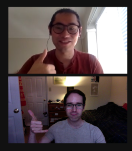
I partnered with Cheng, a fellow student from the other side of the United States. We utilized tools like Skype, Miro, and the collaboration feature on Adobe XD to work together.
Seeing as we only had a week to create an awesome app it was tempting to start designing the first thing that came to mind. But, being master UX designers, we both knew that the quality would suffer if we didn’t invest significant time in research and ideation.
We started by learning about NASA JPL missions, intensely researching 11-13 year olds and best design practices for that age group. We also looked at educational tablet games to glean some insight from them.
After research we condensed the findings into a design persona and an emotion map to guide our future decisions.

Key Findings:
1. Tweens tend to be sociable and their social standing is important to them.
2. Kids, tweens especially, long to grow up fast.
3. Digital health is a growing trend, so often times parents limit their kids’ time on devices.
We then initiated a frenzy of ideation sessions. No idea was too crazy. No idea was too farfetched. No idea was too ridiculous. We came up with everything from a TikTok video assistant, a space selfie experience, an alien explorer game, and even a planetary Tinder spoof.
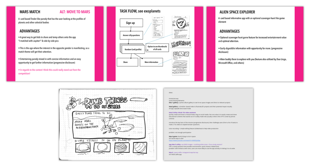
Eventually this process of taking elements that worked and ditching elements that didn’t work lead us to the concept we would pursue and iterate on.
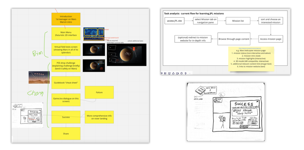
The user would be the first teenager on Mars. The app would be a digital “Handbook” to learn non-sensical “Skills” for living on the red planet. “The Teenager’s Handbook to Surviving Mars.”There would be 50 skills to learn, and learning each skill would present the user with entertaining items to share with friends on social media apps such as “what it would sound like to sing on Mars” or “what space selfies would like.” The user would also have the opportunity to learn about NASA JPL missions along the way.
For the competition we decided to prototype the process of acquiring a single “skill.”
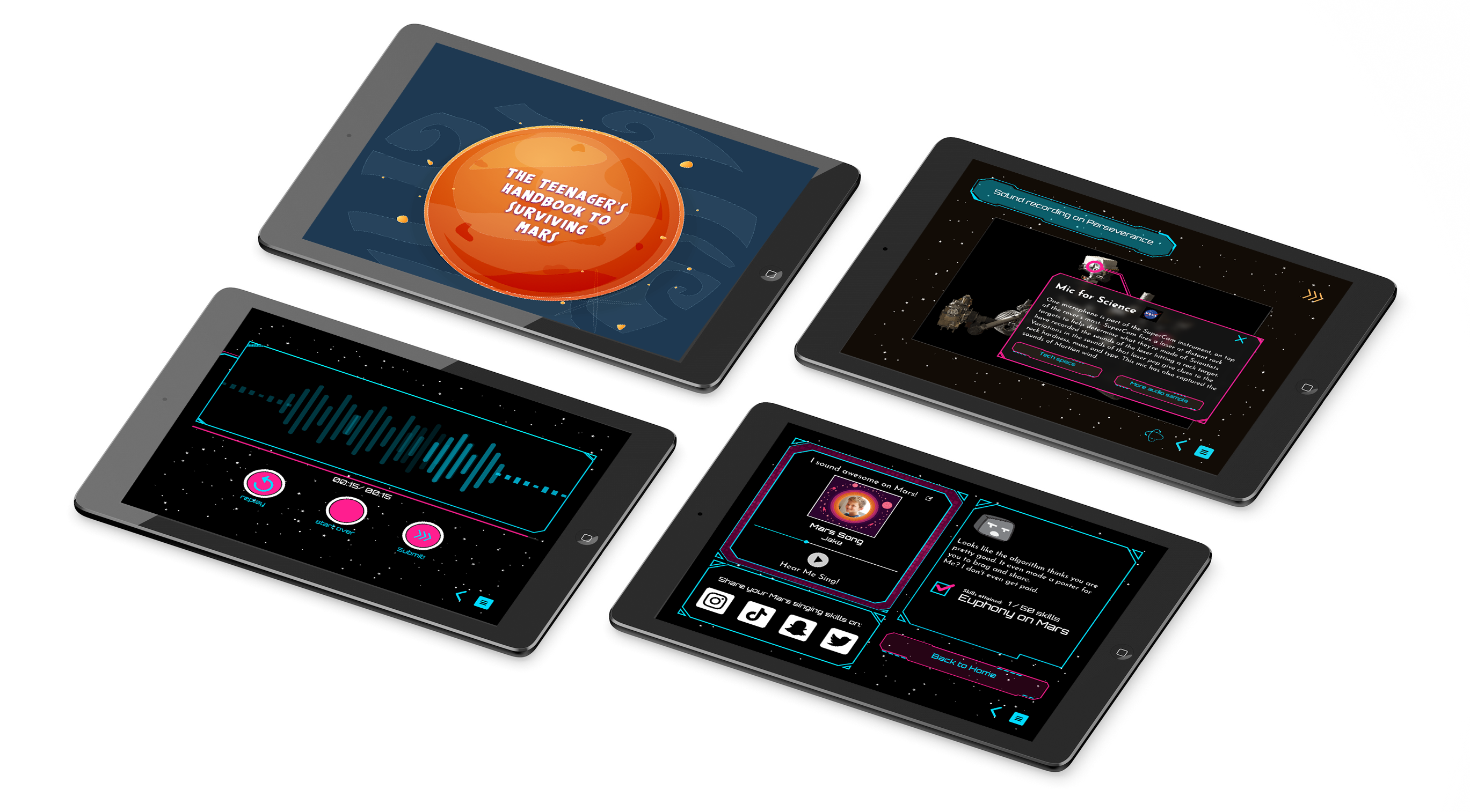
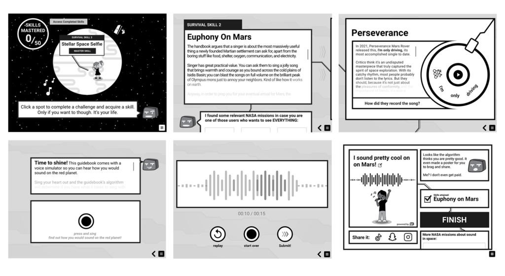
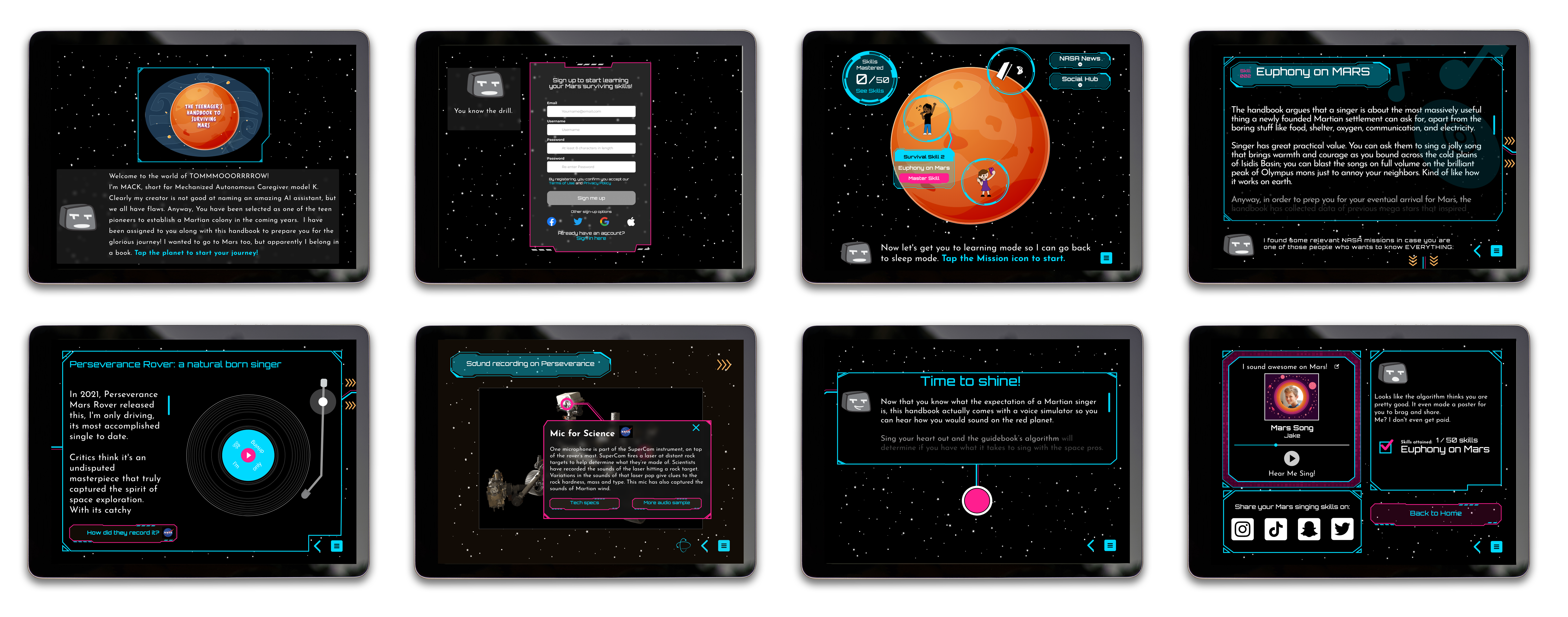
The “Euphony on Mars” mission would involve the user learning about how the Perseverance rover recorded sound, why that was important, and gave the user a chance to sing their favorite song through a filter that would simulate what the song would sound like on the red planet.
Euphony on Mars – Mid-Fidelity
The “Euphony on Mars” mission would involve the user learning about how the Perseverance rover recorded sound, why that was important, and gave the user a chance to sing their favorite song through a filter that would simulate what the song would sound like on the red planet.
We then spent extra time after the competition expanding on the prototype, developing an improved visual style, and testing the app to make sure the app was user friendly, learnable, and easy to navigate.
The project presented a challenge and a tremendous learning experience for multiple reasons:
1. The power (and pain) of consistent team meetings.
Every day before the competition ended I met with my teammate once or twice a day to discuss, ideate, and collaborate. We would spend hours together, and there were times where I felt like the time might have ben better spent in Adobe XD making wireframes. But I know the give and take ultimately made for a much better product and the time we spent collaborating was not only necessary but invaluable.
2. The importance of efficiency and prioritizing.
We only had 1 week to turn in a well-designed prototype. That meant we had to work smart and cut back on activities that might not have yielded as much value. We had to make quick decisions on what to spend time on in order to get the best possible submission. Did we make the right calls? I’d like to think we did, but I’m not sure. Did I learn a lot in the process? Heck yeah I did!
3. Designing for a specific audience.
Most apps cast a fairly large net, but we were very specifically targeting tweens. The research we did was valuable because otherwise we wouldn’t have known the difference between designing for adults, tweens, or kids. Therefore the app would not have appealed to our target audience.
Despite the constraints I’m pleased with what we built. I guess you could say the design prototype was… out of this world?
No? okay.