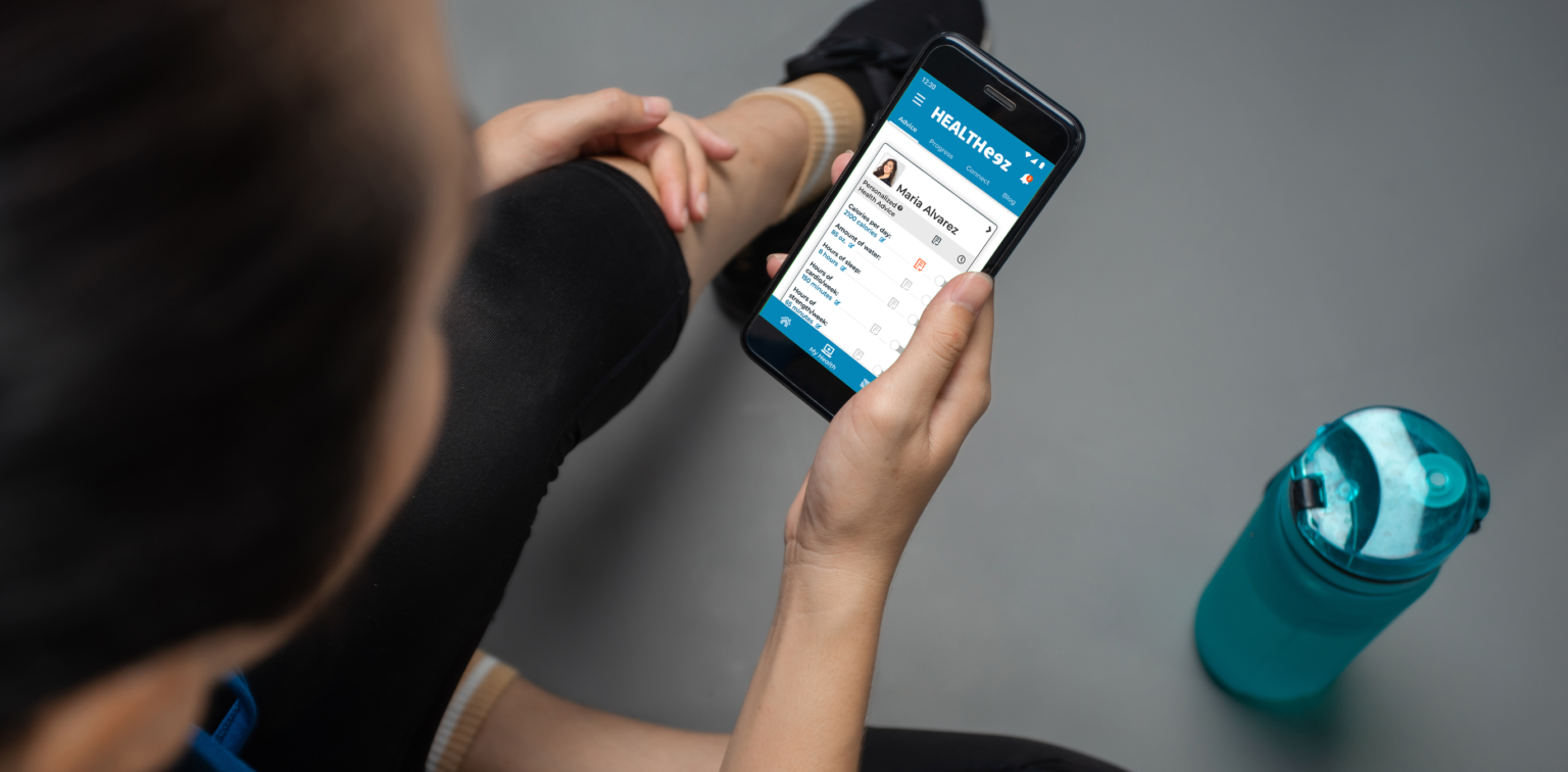
Healtheez is an app that seeks to conveniently and concisely give a user the information they need to stay healthy and fit. They are given personalized benchmarks through an algorithm, and have the option of collaborating with doctors and personal trainers for more input. The app organizes the information simply, and also provides tools to assist with reaching health goals such as reminders, daily trackers, and an appointment booking function.

Role: UX Designer, UI Designer
Timeframe: March – July 2021
Deliverables include: Wireframes • competitive analysis • user interviews • design personas • user flows • sitemaps • rapid prototyping • user tests • high fidelity mock ups
Project: An end-to-end design project as part of CareerFoundry’s cirriculum. The goal was to learn and familiarize myself with crucial user experience thought processes and practice design thinking while creating common deliverables.

It’s unclear to most Americans about what health benchmarks they should be meeting daily. There’s no one-size-fits-all answer and it depends on many personal factors. Getting those answers can sometimes be time consuming or expensive (ie hiring a personal trainer) which acts as a barrier to many people to gaining such essential knowledge.


An app that gives you personalized health goals based on an algorithm according to your profile. It also gives you the ability to get professional input from doctors or personal trainers for an even more focused and professional touch.
My goal was to learn what features users value in a health app and what aspects may be unmet in the current market
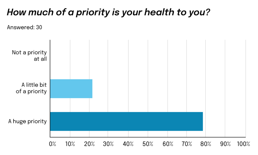
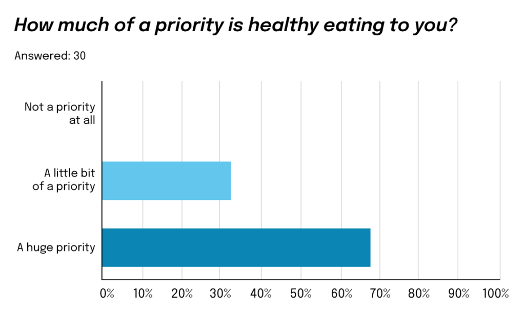
Insights: My surveys and interview questions indicated that there was a gap between people’s goals for their health and lifestyle and knowledge they have to get there. Interviewees didn’t have a firm foundation and didn’t know exactly where to find it.
I used these base findings to do more research on the topic, and found some studies indicating that most Americans are undereducated about basic health knowledge…


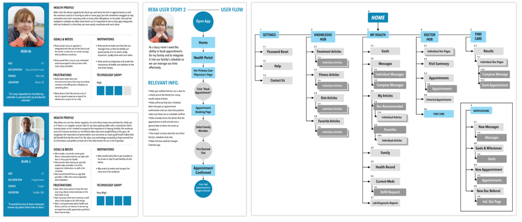
The design personas were very different but similar. Both were aware that they were getting older and were starting to realize the importance of investing in their health. Both of them were busy (Alan with his career and Reba with her family) and found that investing time was difficult to fit in.
One key difference was Alan already had good habits in place, so he found more value in the assistance tools. Reba, on the other hand, didn’t know where to begin, so she would find much more value in the key “Health Advice” features of the app.
I decided to focus primarily on Reba, because according to my research:
1. Like my Reba persona, a majority of Americans are undereducated in health knowledge, which indicates a big unmet need.
2. Gen. X is the most neglected age group when it comes to health/fitness marketing and products, so targeting people like Reba would be a great opportunity.

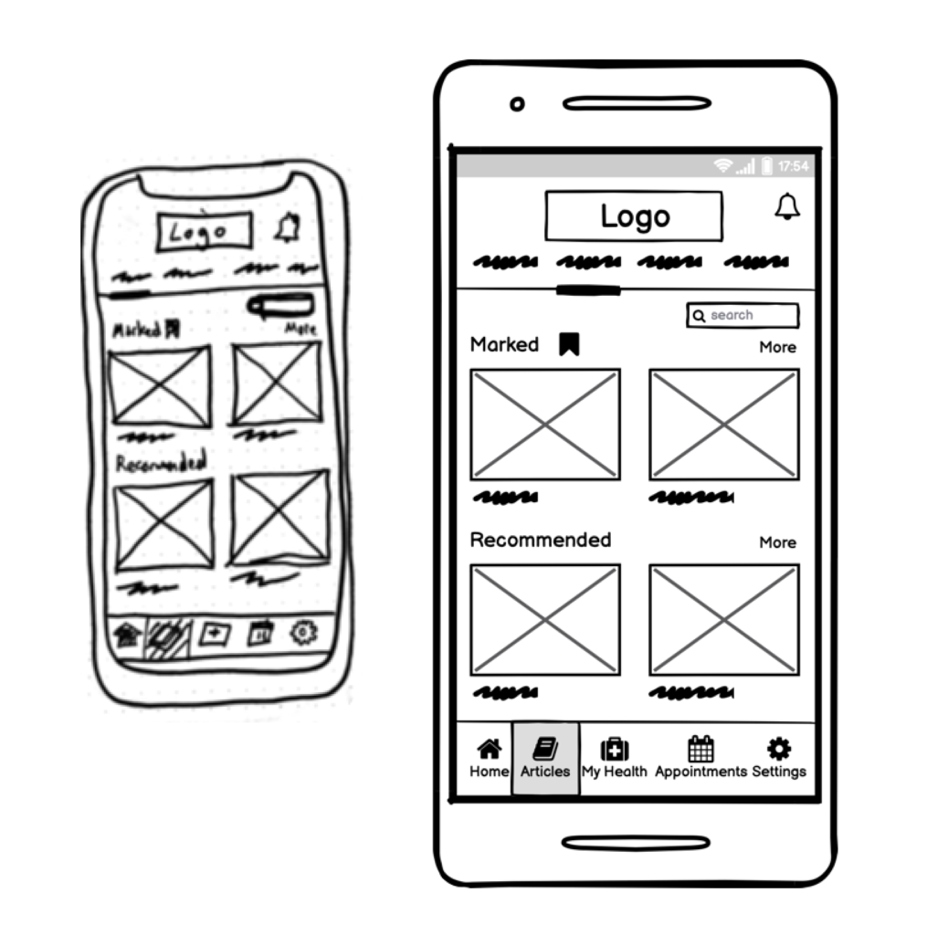
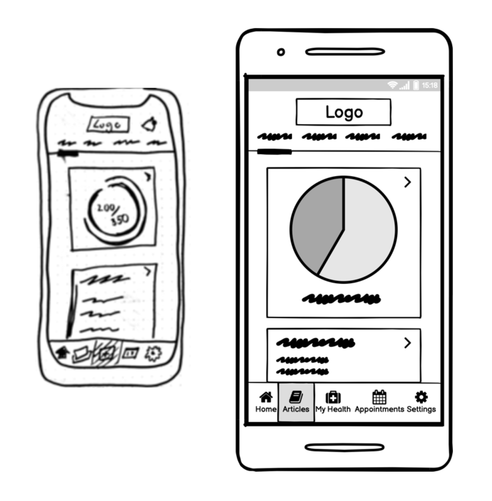
Early feature ideas included an article archive and progress trackers. I decided to scrap the archive feature since I didn’t think my personas (the users) would find a lot of value in it. I kept the tracker feature but deemed it a low priority to expand upon after the most important features were polished.
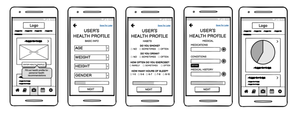
I focused on a health advice feature, that would give users health goals and benchmarks according to their profile input.
The “Health Advice” feature would provide value and solve a problem by simply giving users information they didn’t have before to make good health choices.
The feature would also be an excellent way to build user trust in Healtheez as a company, and would keep people engaged as they try to meet and exceed health benchmarks.

Goals:
• To find ways to improve the navigation on the app in order to make the experience more seamless.
• To determine if key forms that activate a lot of benefits for the user are easy and effective, and how they might be improved.
• To gain perspective into if users would find value in the features being presented.

With the above goals I tested 5 users mostly similar to the design persona Reba: Gen. X age group with busy schedules.
I found that users tended to focus on the top navigation in this instance so I moved important links to the top and made the bottom navigation simpler and broader.
Test participants also indicated that they would find a lot of value in the app’s features. While also recognizing that there was a bias in these findings (most subjects were friends of mine) none the less it coincided with my hypothesis.

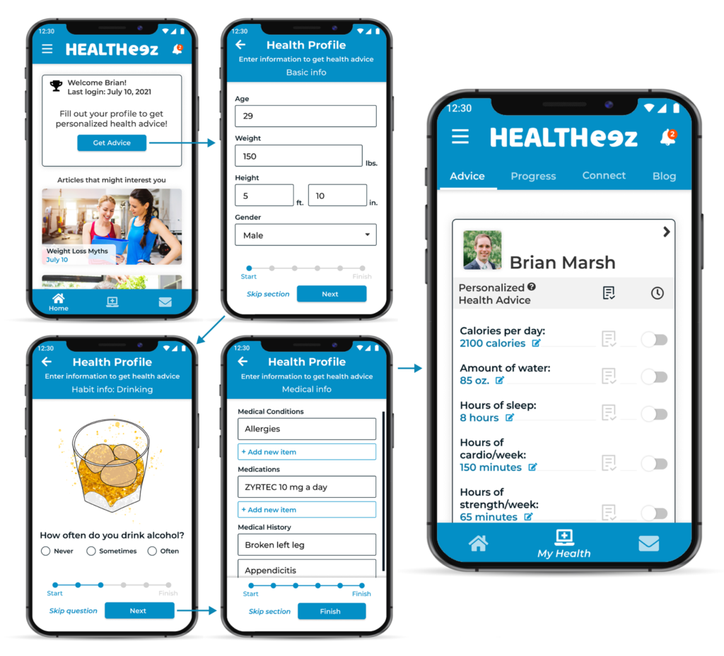
Feature 1: Health Advice
A simple list of benchmarks given to user after filling out their health profile, given in an easy to reference format available at the user’s fingertips.
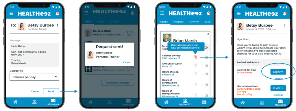
Feature 2: Collaboration
My research showed that a big weakness of mental and physical health apps out there is the lack of clinically-backed professional input, and consequently a lot of the information can be misleading or wrong. That’s why I included ways to request or receive input from your doctors or personal trainers to help ensure accurate information where other apps may be lacking.
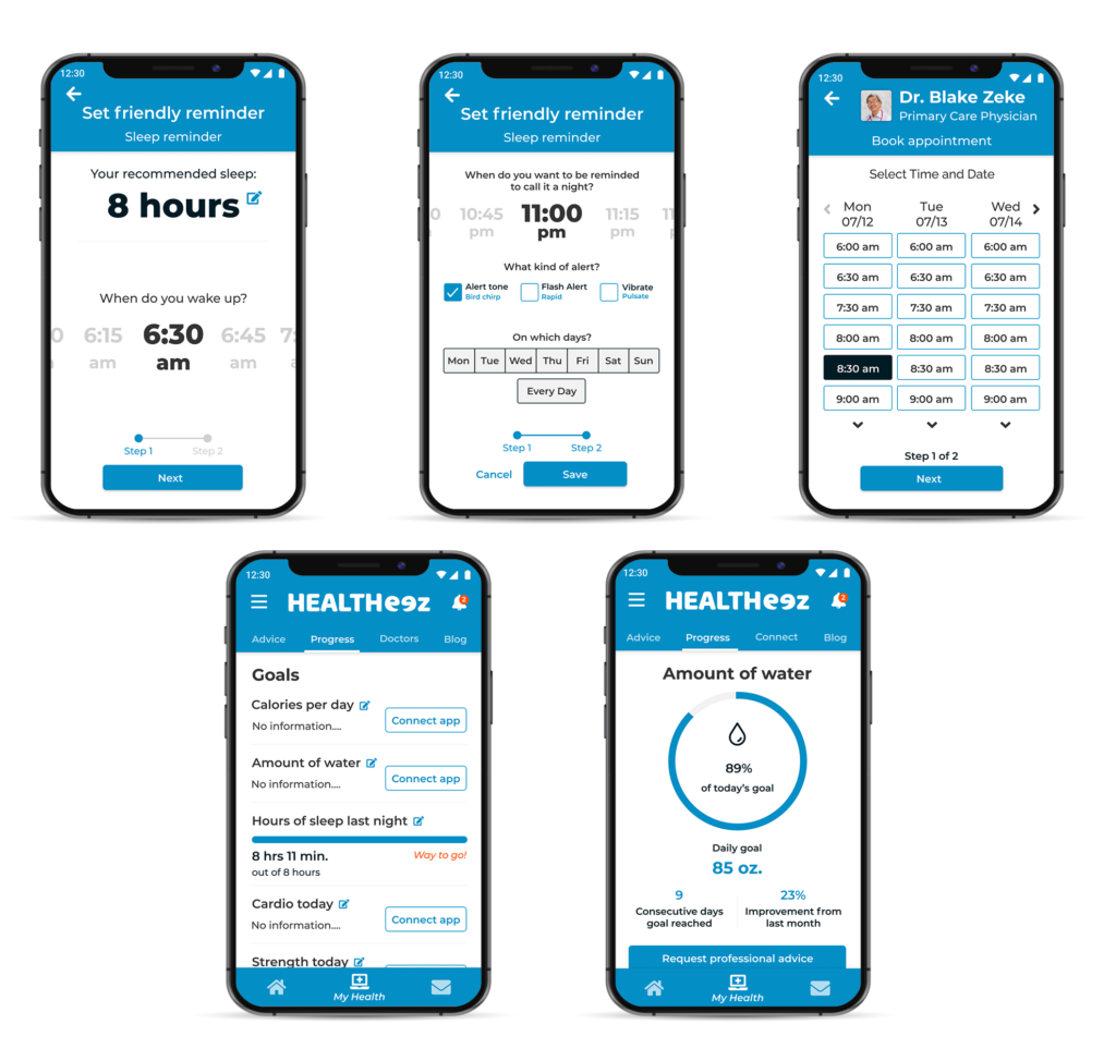
Feature 3: Assistance Tools
The app would not stop at just providing information, but also seeks to help the user make use of the information to meet and maintain their health goals. This includes reminders, appointment bookers, and tracker app integration.
Although a student project, I learned a heck of a lot more than just how to make certain design deliverables. More importantly, I learned the importance of design thinking, empathy, and listening to the user.
I started out thinking that people wanted a one-stop-shop app with tons of features, but that assumption was quickly sidelined after I did more research and learned from the people I interviewed and tested. The end result was an app that I’m confident users would find a lot of value in!
Further down the line I would like to explore ways to shift health advice according to users’ goals (such as to get clearer skin or to lose weight.) I would also would like to do more specific research on Generation X users in order to hone into the opportunity to reach users that are generally neglected by marketing efforts. But all in all this MVP is a great start!