
Imagine This Company is a screen printing company that is known for a lot of things. But their best stream of revenue is making pet lover products including car magnets, wood signs, decals, t-shirts, etc. They sell wholesale as well as retail, and needed a modernized website that helped them do both.
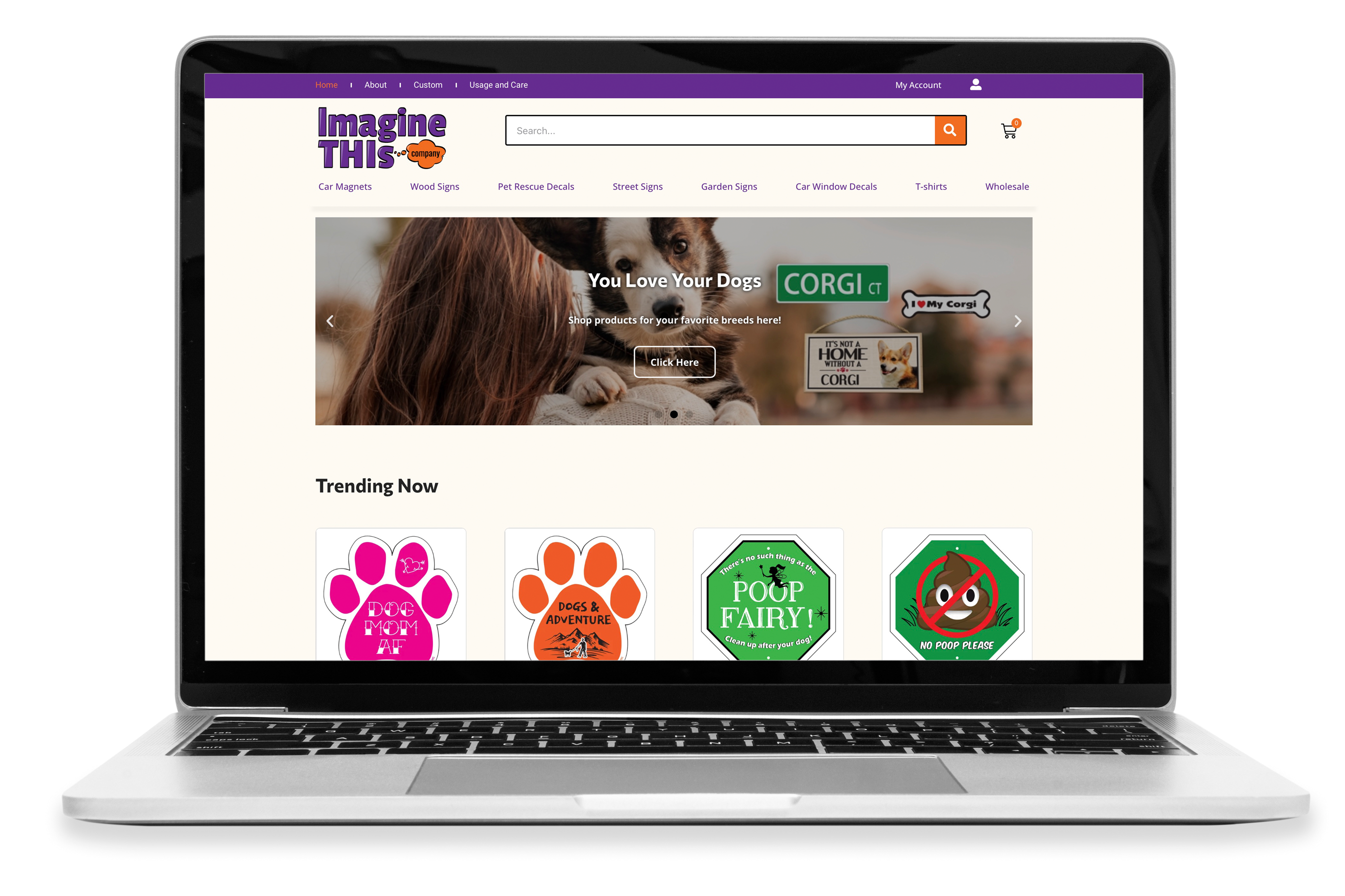
Role: UX Designer, UI Designer, Web Designer
Timeframe: Mostly August 2021
Deliverables include: Fully functioning site • wireframes • surveys • user interviews • design personas • user flows • user tests • high fidelity mock ups
Project: A Lean UX project where I was tasked to design and implement a new website selling most of their products in a short amount of time. The site itself was made using WordPress and Elementor.


1. Who is the user?
Millennials and Gen. Z customers.
2. What are the goals of the site?
To increase sales, both wholesale and retail. To serve as a landing page for the company with information on services provided.
3. How would we know if the site redesign was successful?
Increased sales.


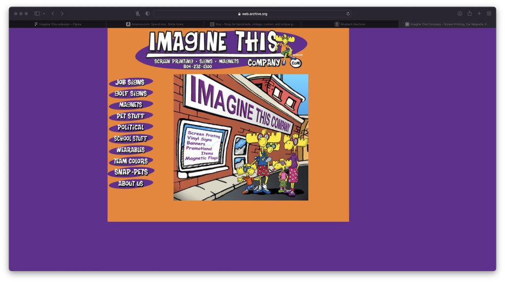
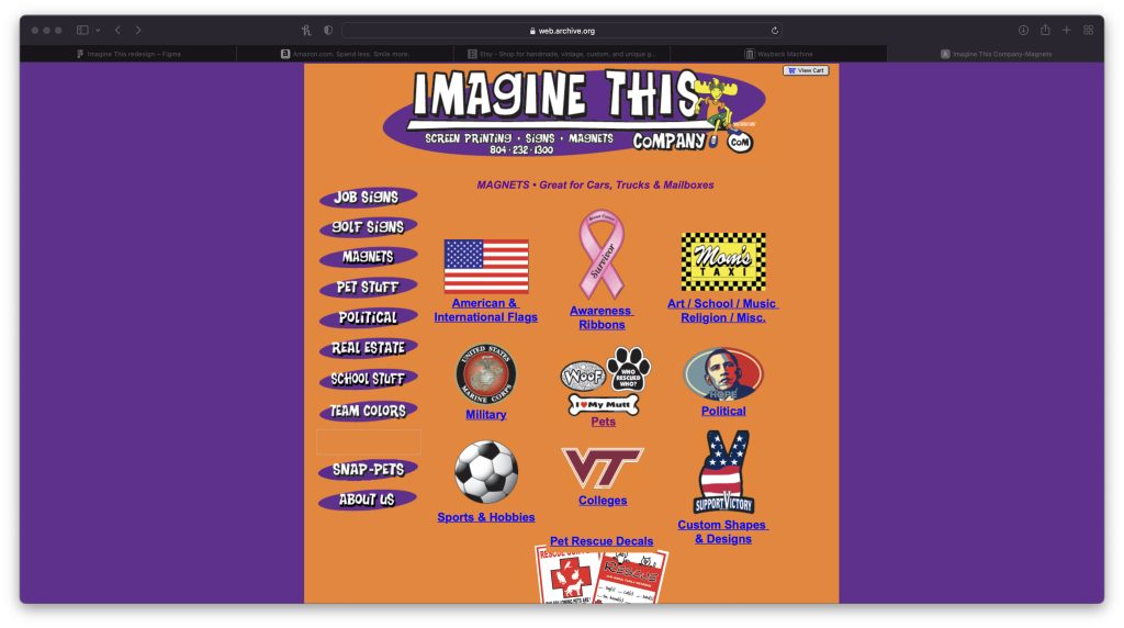
There was plenty of room to improve but they still wanted to keep a general adherence to their brand.


My main goal before starting on IA and wireframes was to learn what millennials and gen. z consumers valued in an e-commerce site.
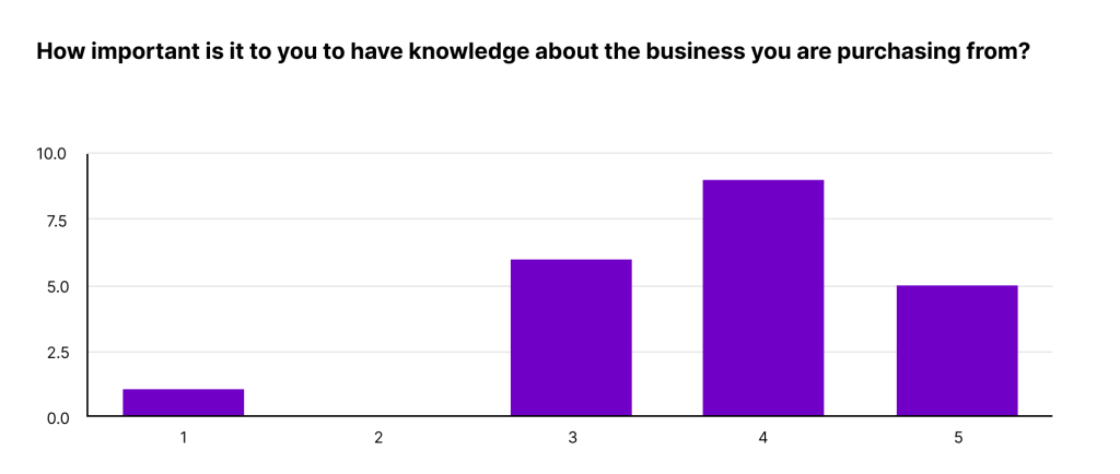
It definitely seemed like they valued knowing what company they are supporting, so we knew to emphasize candor. We would include tidbits about the company on the home page as well as an easily accessible “About Us” page.


Insights: Amongst other things a key pattern was users’ desire for a straightforward and simple shopping experience.


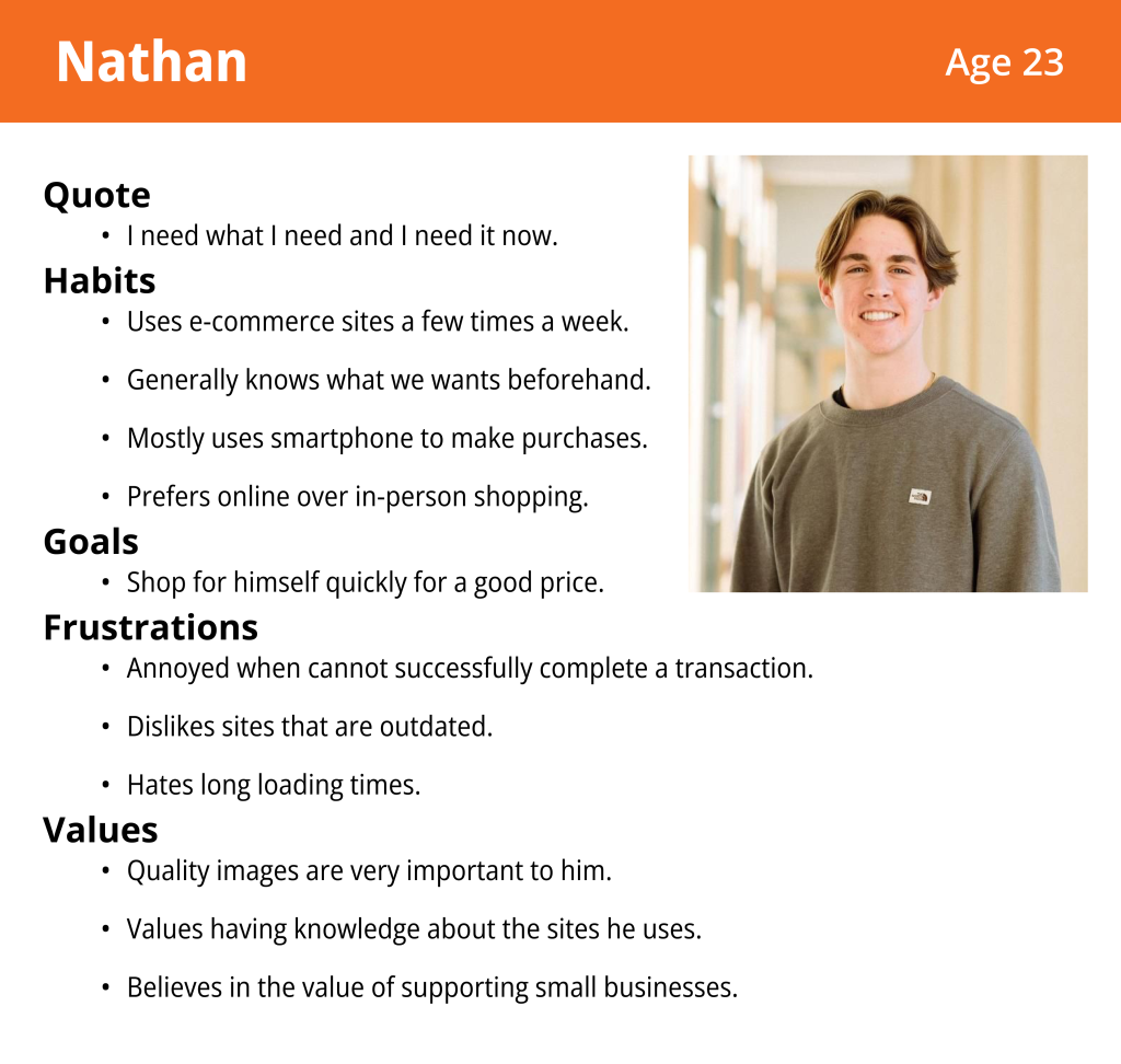
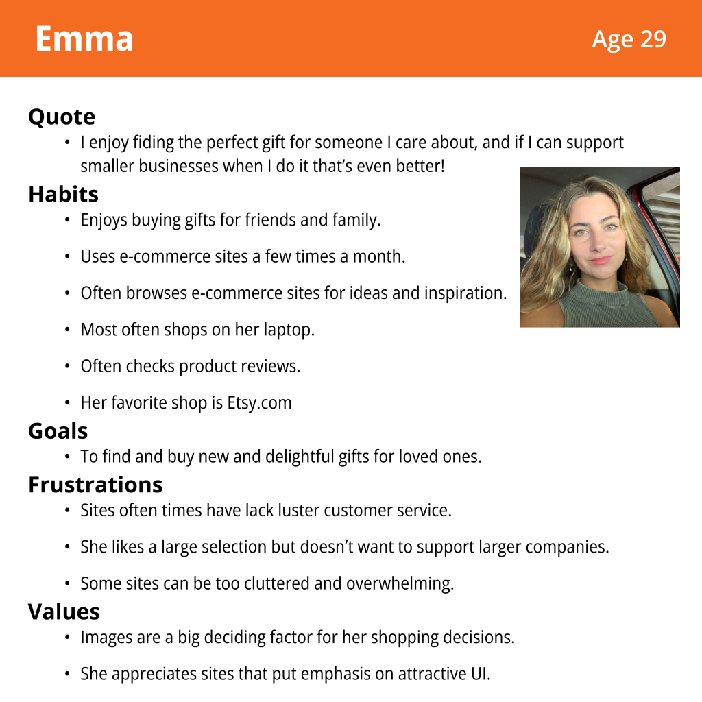
Different user styles are represented. Search vs. browsing. Shopping for yourself vs. others. But both value shopping small businesses and, for differing reasons, both value simple and straightforward sites.



E-commerce sites are nothing new and there are plenty of successful sites out there. Especially since the deadline was tight I was not going to stray much from the conventions users expect.
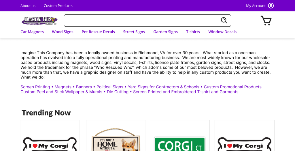
The first iteration of the site contained a blurb about the company and all of its services it provides.
The conundrum here was that although Imagine This was best known for pet lover products, the brand itself included many more services, and the managers wanted that to be quickly apparent.
I didn’t like that users were hit by a big block of text when entering the site, and had a hunch the users would feel the same…


Goals:
• To determine if information architecture made sense to users.
• To see if site’s purpose was quickly apparent (“Imagine This Company” does not exactly scream “seller of pet lover gifts”)
• To determine if there were any other improvements we could make.

With the above goals I conducted (some impromptu) tests using the live site.
Findings:
• Users complained loading times were too long.
• Users indeed express confusing first impressions on home page.
• Interest was expressed on different browsing options (topic or breed specific)
Solutions:
• For product lines with a large amount of individual products to load I created landing pages
• I convinced the stakeholders to use a carousel on homepage instead of a big block of text, the first carousel being a brief explanation of the services Imagine This provides.
• Other carousels were links to special browsing pages.



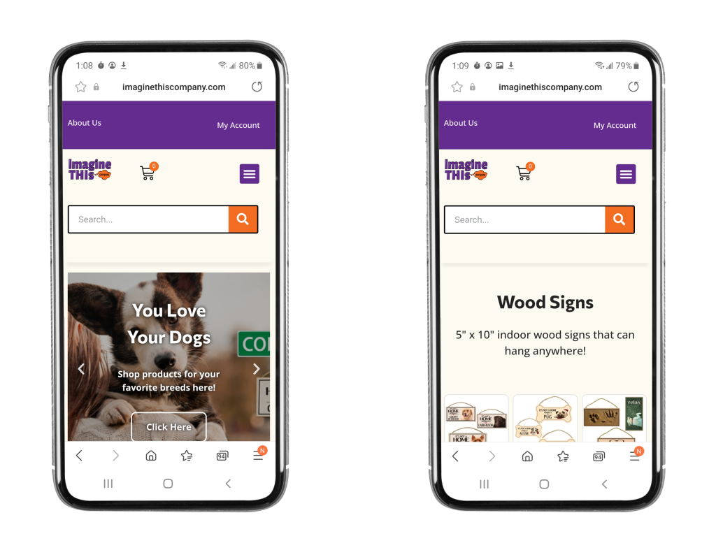
After the site’s launch sales increased noticeably, though we had no metrics to measure demographics. I’d be curious if we reached the younger audience we had our sites on.
It was great for me to experience firsthand what it was like to work with constraints. I was just learning Elementor and WooCommerce, so we couldn’t get too fancy with the technology and had to get creative in solving problems with the site. There was also a very real time constraint and I had to be very intentional about what steps I took and making them count.
It was also great to experience working with a UX immature company. The stakeholders, in the end, wanted a quality product that represented the company but were confused at first why I wouldn’t start building the site right away. I got valuable lessons in being able to articulate the design thinking process and why it’s important.
Future Plans
• One element that we were not able to implement right away was a review system. Social proof is important especially with younger generations, so such an addition would be beneficial.
• Although wholesale pricing is available on the site, is there a way to cater parts of the site directly to wholesale customers buying in bulk?