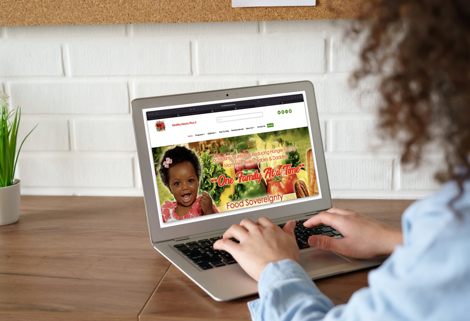
HHP2 is an organization that seeks to improve eating habits and healthy routines for people in under resourced communities. This emphasizes new mothers and babies in order to fight low birth weight and infant mortality.
A usability audit would help ensure that their website will be more effective in order to increase support, engagement, and excitement towards their mission, ultimately enabling them to serve more people and areas.

Role: Volunteer UX Designer
Timeframe: December 2021 – February 2022
Deliverables include: Improvement outline presentation • Solution recommendations • High-fidelity mockups • User tests
Project: A site usability audit for a local nonprofit. The site was redesigned recently and the goal was to make the new site as effective as possible for accomplishing stakeholder goals.

First things first; I wanted to get a good foundational knowledge about the “Why” and “Who” behind the site…
1. Who is the user?
2. What is the main goal of the site?
3. Is there a secondary (or more) goal(s) for the site?
4. How would we know this site is successful (specific)


1. Users are potential supporters / donors / volunteers.
2. The goal is to get people, organizations, and corps to invest their resources to drive our mission
This could look like more donations (especially lifetime donations), corporate partnerships, or people volunteering their time.


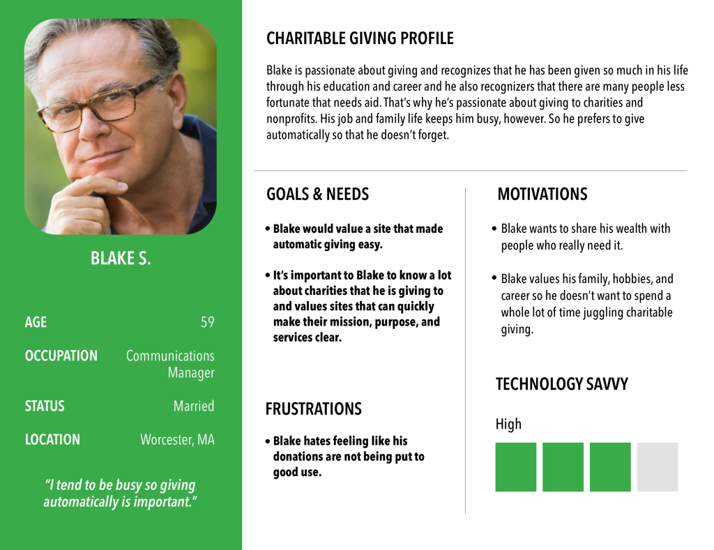
According to research I conducted online:
• Baby Boomers give the most to charity, especially in the lifetime support category. So it makes sense to target Boomers most.
• Transparency is important to most donors. Blake appreciates knowing what the charity’s mission is and how donations are spent.
• Recurring automatic donations are most common, so Blake would find value in easily setting up an automatic monthly donation.
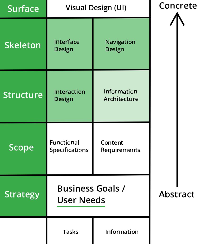
What Aspects I Explored:
• Issues mostly on higher concrete levels (issues marked in light green.)
• Scope and Strategy seemed to be solid, though I’d like to explore User Needs in the future.

What Aspects I Explored:
• Issues mostly on higher concrete levels (issues marked in light green.)
• Scope and Strategy seemed to be solid, though I’d like to explore User Needs in the future.
• Relatively simple site with most pages driving the goal forward.
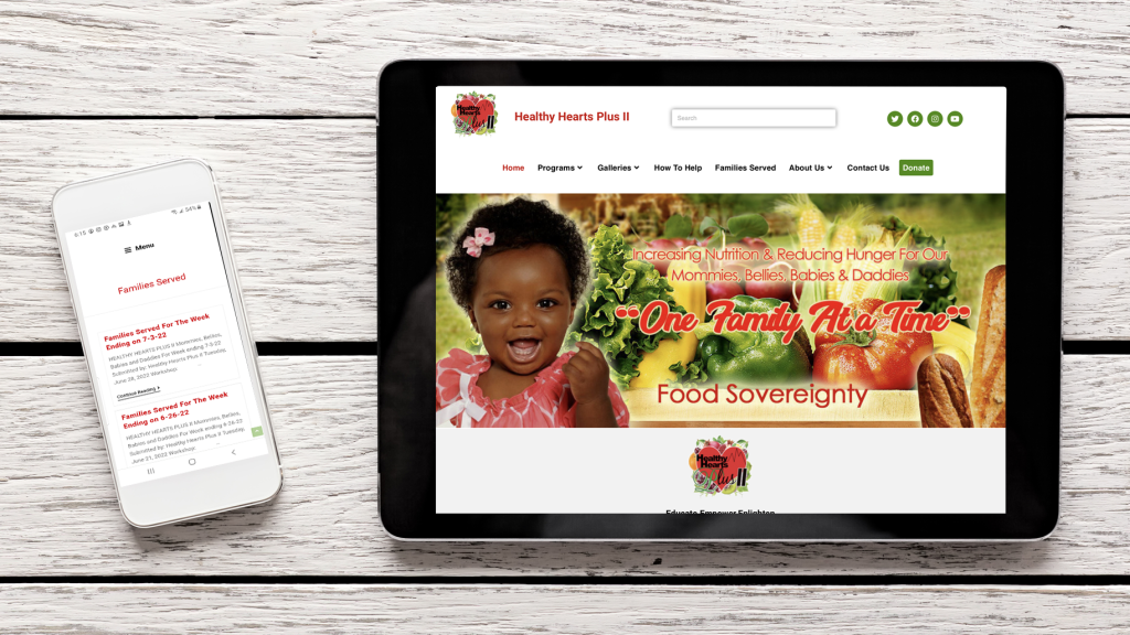
• Responsive design that works well on any device.
• Strong visual design. Overall consistent interface that helps convey a professional and secure feeling in users, as well as large letters and high contrast for accessibility.
• Donate button noticeable and in a great spot on every page – GREAT since this may be the most important feature.

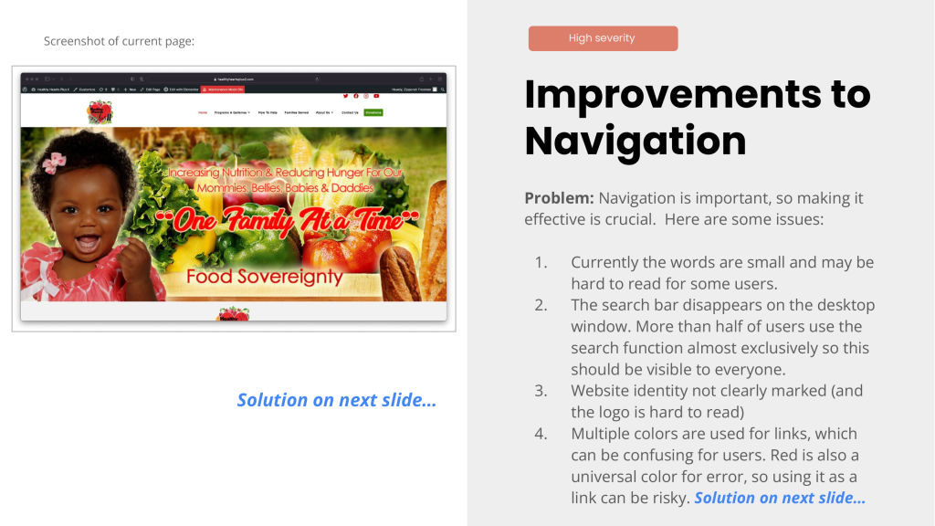
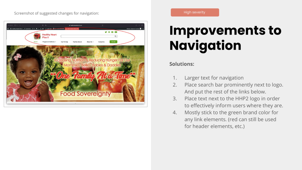

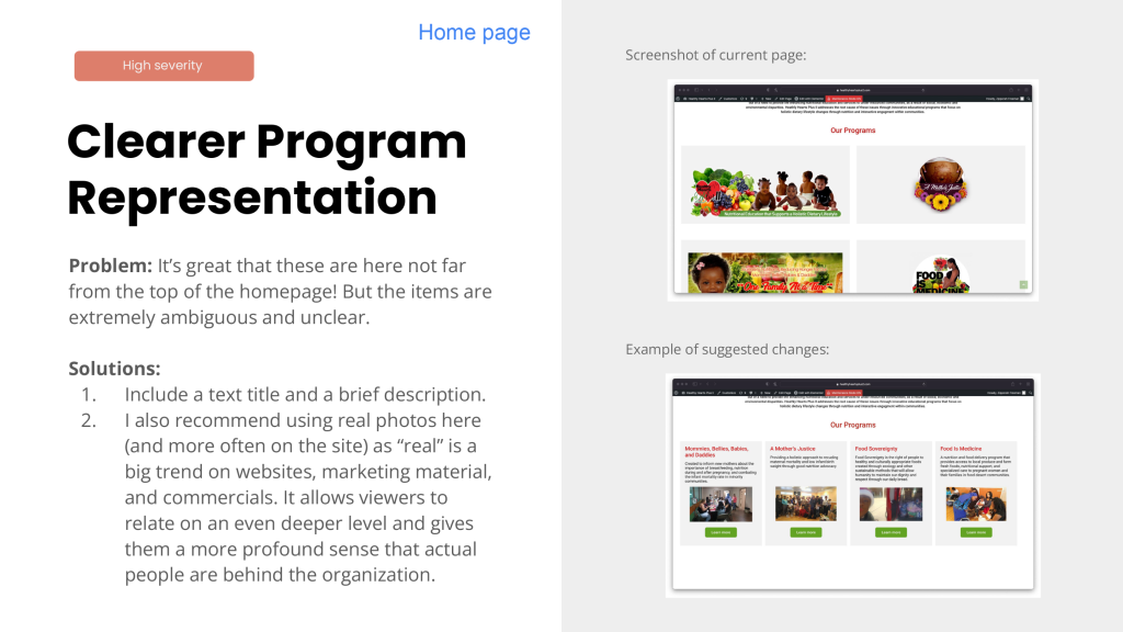
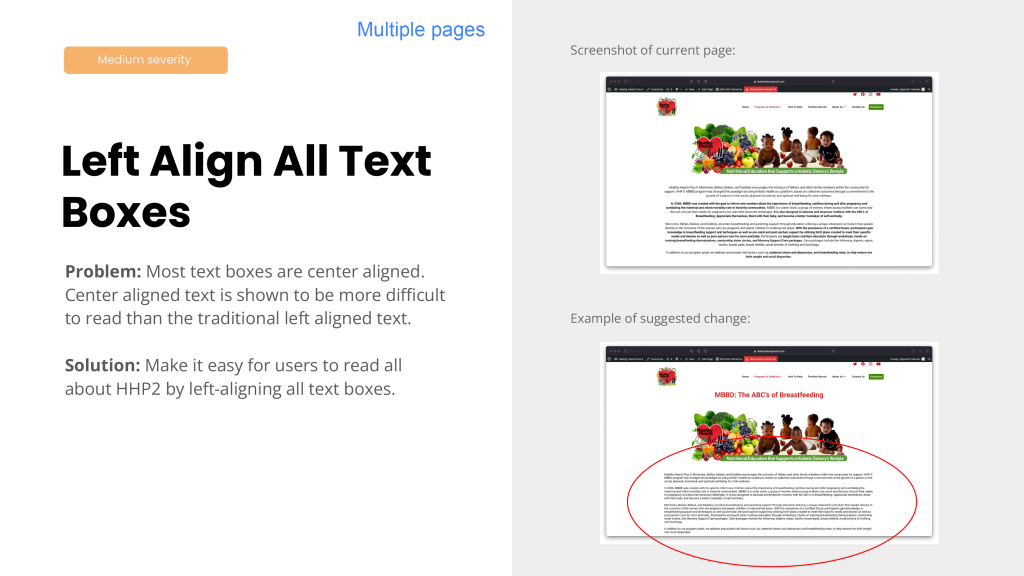
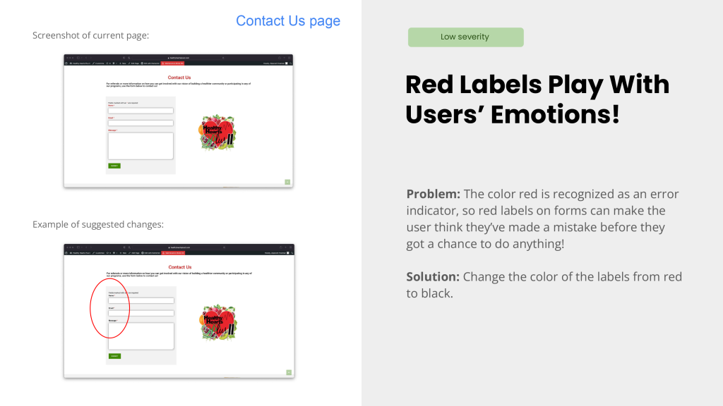

Next was the virtual meeting between me, the client, and the web designer that had redesigned and developed the site. I had sent them the presentation ahead of time but this way I was able to explain things more clearly and they were able to ask questions.
We were also able to discuss the suggested changes. A few went against the client’s vision and intent and some were not viable to implement. Below you will find some highlights of conclusions that came from the meeting:
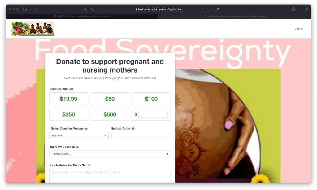
Their separate donation page was a paid service that included some perks, the most important of which was the ability to make recurring donations.
I told them to make the style a little bit closer to the original site if possible.
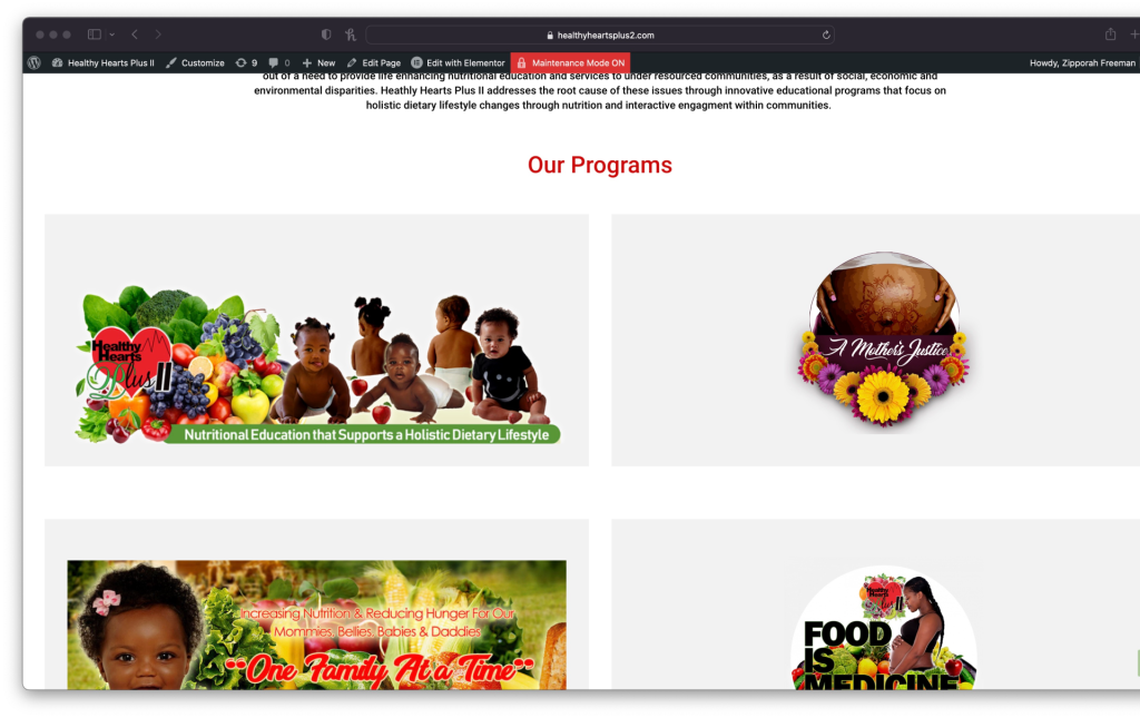
Even though these logos are complicated and hard to read, the client explained that they were part of the individual branding of each program and the element that tied their identities together through social media, emails, etc.
So we agreed to keep these links as is.


Goals:
• To determine if site was making it easy for users to accomplish important tasks or if we can improve on it.
• To determine if users do regularly connect to charities or nonprofits on social media or if there’s a better way to stay engaged.

In order to either validate or correct my solutions I wanted to get less biased viewpoints by conducting user tests. And I got both validations and corrections! Here are some highlights:


In the end not all of my changes were implemented, even if we all agreed upon them.
Part of it could have been because the web designer was busy or lack of motivation (she was a volunteer as well.) Part of it may have been because the client had other priorities. It definitely seemed to me that user experience design was a fairly new concept to her.
Whatever the case may be some important changes were made which lead to a more effective website!
This usability audit was a great reminder about the give and take between designers, developers, and stakeholders. There were sometimes good reasons for not making my suggested changes, and that’s something that we wouldn’t have known unless we collaborated and discussed together.
It also highlighted the importance of being able to advocate for user experience with people who are unfamiliar with the concept. A smooth and easy to use website can make the difference between competing charities. It’s not simply a small nice-to-have detail. There are many causes that people can give to, so having that competitive edge is important.