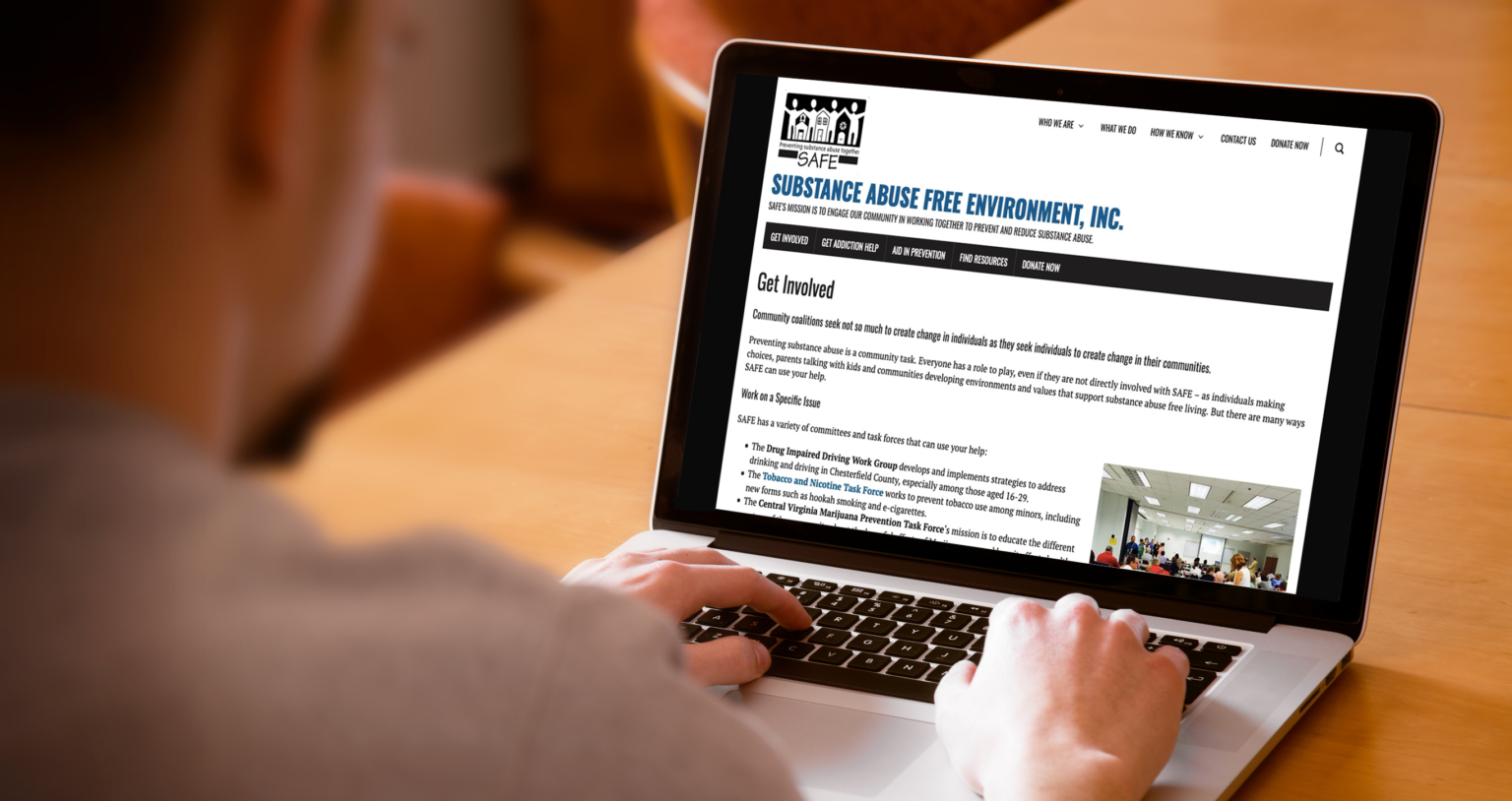
Chesterfield SAFE is an organization in Virginia aimed at preventing and reducing substance abuse in the county of Chesterfield.
A website usability audit would help ensure that users would be able to find what they’re looking for, ultimately leading to more engagement and people being helped.
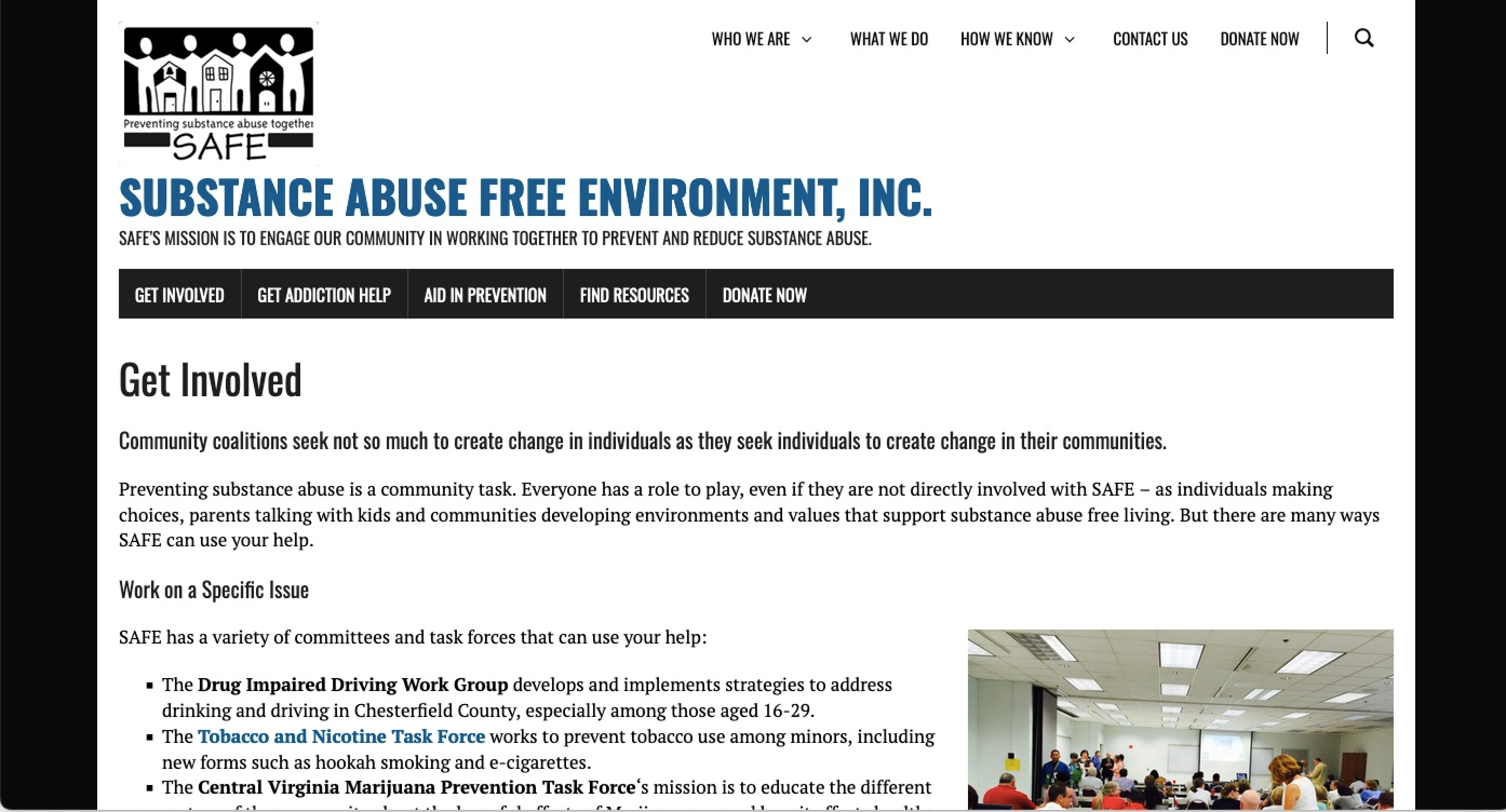
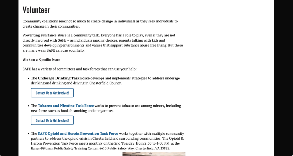
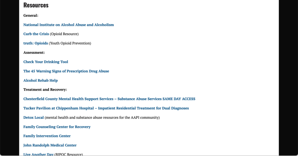
Role: UX Researcher + Web Designer
Timeframe: March 2023 – May 2023
Deliverables include: Website evaluation • Findings presentation • Solution recommendations • Tree testing • Improved information architecture and website
Project: A site usability audit for a local nonprofit. The goal was to make their site as effective as possible for accomplishing stakeholder goals.


First things first; I wanted to get a good foundational knowledge about the “Why” and “Who” behind the site…
1. Who is the user?
2. What is the main goal of the site?
3. What are some secondary goals for the site?
4. How would we know this site is successful (specific)


1. User: Potential partners and community members (youth and parents) seeking resources.
2. Goal: Connect our partners and community members with useful resources to help prevent and reduce substance misuse in Chesterfield County.
3. Secondary Goal: Fundraising, Community engagement including recruiting volunteers.
4. We know the website is successful when…
• Website is accessible and functional.
• Increased amount of users.
• Users are engaging with SAFE beyond the website.


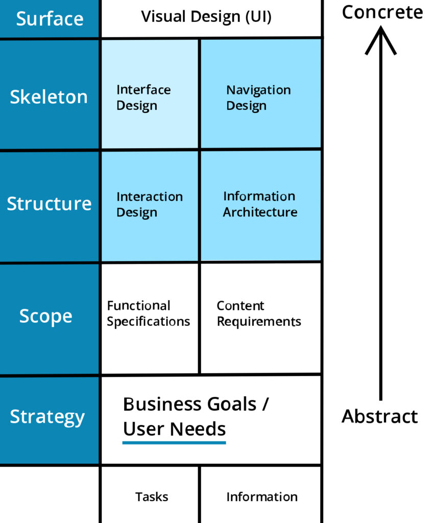
What Aspects I Explored:
• Issues mostly on higher concrete levels (issues marked in blue.)
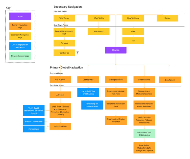
• The navigation and information architecture were the biggest problems, with there being some issues in the interaction design as well.


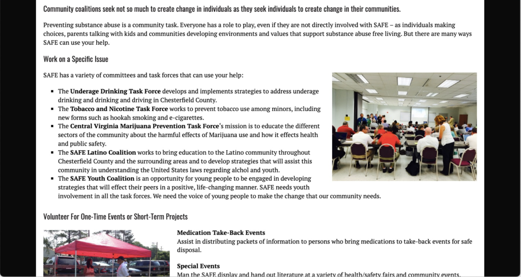
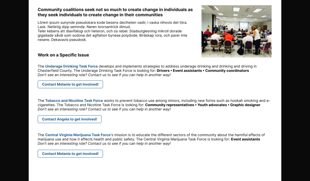
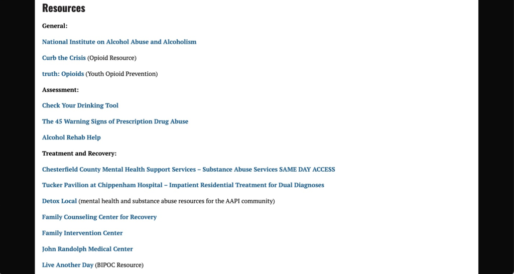

A couple of possible site maps were made to explore what a simpler, more intuitive, main navigation could look like.


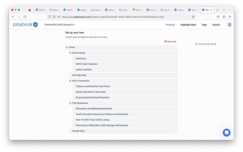
Goal: To determine if users could navigate the new site structure in a variety of key scenarios
Directions: Participants were given different scenarios and they would select the page that they would go to first in each scenario. They were also asked about their confidence level behind each choice.
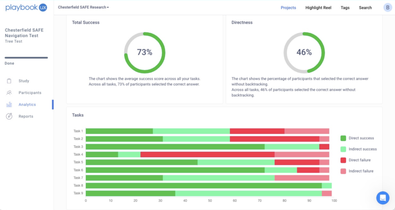
Scenarios tested: 9
Results were overall encouraging but there were some problems with tasks 1, 2, and 4.
Scenario 1: You are a parent and you know some of your child’s classmates vape. You’re hoping your child doesn’t also start vaping. Which page would you click?
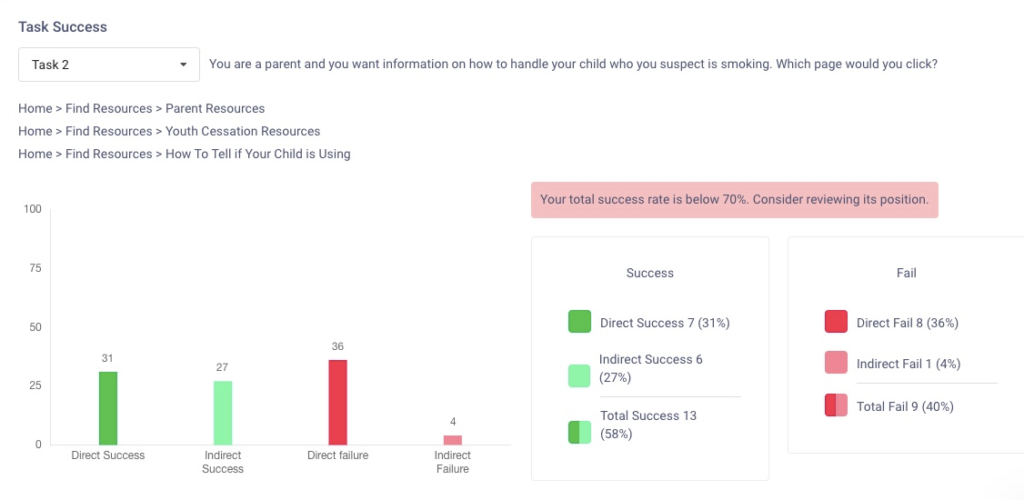
Scenario 2: You are a parent and you want information on how to handle your child who you suspect is smoking. Which page would you click?
The best answer for both was “Parent Resources” but many participants picked “Get Help Now.” That page is more for people with deep-seeded addictions whereas “Parent Resources” is for parents of teens with an emphasis on prevention.
My proposed solution was to rename “Get Help Now” to “Get Addiction Help” to clarify the page’s intent more clearly. We also included a link for parents in case they still went to that page.
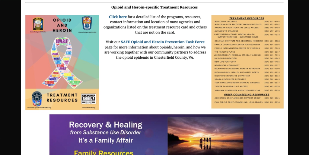
Scenario 4: You hear that heroin is a growing problem in your community and you want to help. Which page would you click?
The best answer was “Opioid and Heroin Task Force” but most participants went to “Volunteer” or “Advocacy.” Those seemed like perfectly valid answers where users could fulfill their goals so I was inclined to label this a nonissue.



After I implemented the changes the site was much cleaner and straight forward with less clutter.
The logical next step would have been to do usability testing for the site, maybe even testing on Spanish speaking users since they make up a lot of the organization’s audience. But it was a volunteer role that I had already worked a long time on so I opted not to do any more testing.
In any case, I was informed that Chesterfield SAFE did get more contacts hoping to volunteer. Whether it was the simplified navigation or increased CTA buttons, it is the result that counts!
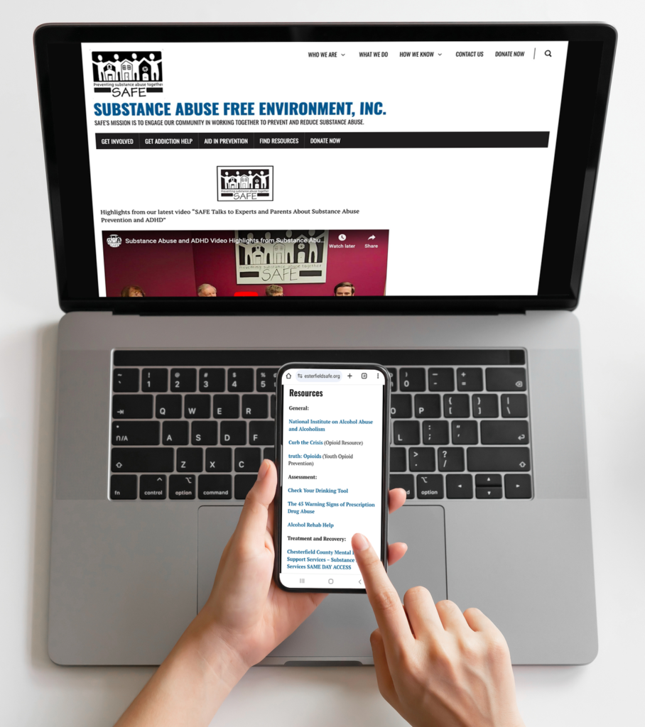
A website’s content can be perfect and valuable but if someone can’t find them they might look somewhere else or even give up. In crisis situations where someone is addicted to a substance that’s not an acceptable option. I’m glad I was able to help.
I also learned that research test results are objective. One of the test scenarios seemed to yield disappointing results. But in reality the participants arrived to conclusions I hadn’t thought of. As long as they fulfill their goal there is no “right” or “wrong” answers.